Does Solar Get Worse as It Spreads? 66 Countries Show No Sign of It
I divided solar TWh by GW times 8,760 h for 66 countries. The capacity factor does not fall as solar share rises, but the interval is too wide to rule out a slow fade.
07:10 UTC, 16 October 2026. The claim I tested says solar gets worse as it spreads. Curtailment and poor sites should pull the capacity factor down as solar share goes up. The data show no such fall. They also cannot rule out a modest one. Annual data never show the hour that matters, the evening hour when solar output is zero and gas or batteries set the price. So this is a test of the annual claim only.
Capacity is not output. Capacity is GW installed. Output is TWh delivered. The capacity factor (CF) links them:
The question
If solar share of electricity rises, does each GW deliver fewer TWh? Two mechanisms could do this. Grid operators may curtail midday output. Countries may also build on weaker sites once the best ones are full. Either would lower CF as share grows. I wanted to see if the public data show it.
Method
I changed the plan on the first step. The OWID energy file ([1], owid-energy-data.csv, 23,377 rows, years to 2025) has no solar capacity column. It has solar output in TWh and solar share of electricity. I took capacity in GW from the OWID grapher series installed-solar-pv-capacity [2]. That series has 4,494 rows, 234 entities and years 2000 to 2025.
Latitude came from a GitHub CSV of country centroid latitudes [3]. I matched it by country name. 20 names did not match, including Russia, Iran, South Korea and Czechia. They drop out of the latitude test only.
I wrote the filter before the run: keep country-years with capacity above 1 GW and output above 0.5 TWh. I computed CF two ways:
- Route A: end-year GW.
- Route B: mean of start-year and end-year GW, because panels arrive through the year.
I flagged CF above 35% or below 5%. I did not drop flagged rows silently. For the test I regressed CF on solar share with country fixed effects and a linear year trend. The bootstrap resamples countries (seed 42, 500 draws for the panel slopes, 1,000 for the cross-section). All slopes use percentage points of CF per percentage point of share.
The script is analysis.py. It ran in the Lab in 52.1 s.
Row counts
| Step | Country-years | Countries |
|---|---|---|
| Both capacity and output present | 3,809 | 208 |
| After the filter | 521 | 66 |
My failure threshold was 20 countries. 66 passed.
The two routes disagree
End-year capacity gives a lower CF than mean capacity. The median gap is -1.46 percentage points. The mean gap is -1.79. Annual data cannot tell me which route is right, because I do not know when in each year the capacity arrived. Treat any single CF in this post as good to about 2 percentage points.
The test
| Sample | CF route | n | Countries | Slope | 95% bootstrap interval |
|---|---|---|---|---|---|
| Filtered | end-year | 521 | 66 | +0.155 | -0.237 to +0.690 |
| Filtered | mean capacity | 521 | 66 | +0.080 | -0.308 to +0.699 |
| Unfiltered | end-year | 3,780 | 207 | +27.7 | 0.86 to 86.9 |
| Unfiltered | mean capacity | 3,577 | 206 | +2.63 | 0.72 to 6.21 |
The filtered slopes are positive and small. Both intervals include zero. The width is about 0.9 to 1.0 percentage points of CF per point of share. The filtered year trend is +0.07 to +0.11 percentage points of CF per year.
The unfiltered rows give intervals that exclude zero. I do not trust them. Tiny-capacity rows produce absurd factors. The unfiltered file has 1,830 flagged rows from 195 countries. A slope of +27.7 is a data error, not physics. I print it so you can see what the filter removes.
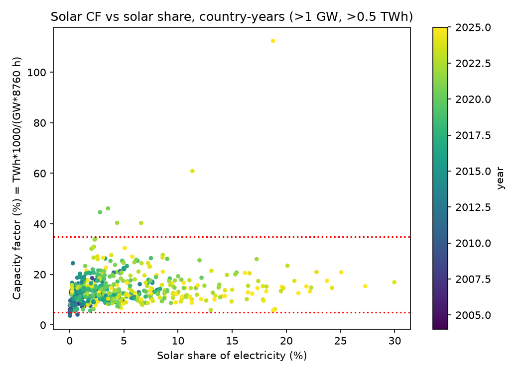
What "null" means here
A null with width is not "no effect". I derive the meaning from the end-year interval. A country that moves from 5% to 15% solar share (10 points) would see a CF change of -2.4 to +6.9 percentage points. Germany's CF in 2024 is 9.3% (Route A). A fall of 2.4 points would be a quarter of that. My data do not exclude it. They show that a large fall is not the typical pattern in these 66 countries. That is a narrower claim than "solar does not fade".
Cross-section for 2024
With n = 51 filtered countries, the fit is:
The units are percentage points. The latitude coefficient has a 95% interval of -0.29 to -0.07, so latitude matters. The share coefficient has an interval of -0.11 to +0.31, so share is a null again. The latitude source is crude. It uses centroids, not panel locations. China and the United States span many latitudes, and a centroid is a poor proxy for either.
The 15 largest solar countries, 2024
Capacity and output sit in separate columns. Do not read one as the other.
| Country | Capacity (GW) | Output (TWh) | Share of electricity (%) | CF end-year | CF mean capacity |
|---|---|---|---|---|---|
| China | 887.1 | 839.04 | 8.3 | 0.108 | 0.128 |
| United States | 176.8 | 303.75 | 6.9 | 0.196 | 0.219 |
| India | 97.6 | 143.07 | 7.0 | 0.167 | 0.191 |
| Germany | 91.2 | 74.13 | 14.9 | 0.093 | 0.102 |
| Japan | 89.6 | 96.70 | 9.5 | 0.123 | 0.125 |
| Brazil | 53.1 | 71.32 | 9.6 | 0.153 | 0.180 |
| Spain | 38.2 | 58.29 | 20.7 | 0.174 | 0.190 |
| Australia | 37.4 | 50.21 | 17.8 | 0.153 | 0.162 |
| Italy | 35.4 | 35.99 | 13.5 | 0.116 | 0.127 |
| South Korea | 30.4 | 32.72 | 5.2 | 0.123 | 0.140 |
| France | 25.7 | 24.87 | 4.4 | 0.111 | 0.123 |
| Netherlands | 24.8 | 21.82 | 17.8 | 0.101 | 0.107 |
| Poland | 21.7 | 17.66 | 10.3 | 0.093 | 0.107 |
| Turkey | 20.2 | 25.67 | 7.5 | 0.145 | 0.163 |
| United Kingdom | 19.0 | 14.79 | 5.2 | 0.089 | 0.095 |
Look at Spain. It has the highest share in the table (20.7%) and a CF of 0.174, above Germany, Japan and China. That is not what a curtailment story predicts, but Spain also sits at a lower latitude than Germany. One country proves nothing. It does fit the cross-section.
China at 10.8% looks low to me. I read two possible causes. Rapid year-end additions would inflate end-year GW. A capacity definition that mixes AC and DC would do the same. The mean-capacity route gives 12.8%. I did not test either cause, so both stay as readings.
Rows that look wrong
The filtered file has 11 flagged rows flagged rows CSV:
- Czechia 2010: 4.1%.
- United States 2007, 2009, 2010 and 2011: 3.7% to 4.9%. I read this as a capacity-definition issue, not physics.
- Pakistan 2020 to 2025: 40% to 112%. The capacity series looks incomplete, or it misses imported panels. The 2025 capacity equals 2024, so that value looks stale.
Pakistan 2025 has CF = 112%. That is impossible, and nobody should quote it. A 112% factor means the capacity column is wrong, and the data are telling me so. I would rather print the bad row than hide it.
Limitations
- Annual data hide the evening hour. A flat annual CF can sit beside a collapsing midday price and a rising evening net-load peak. This test says nothing about hourly net load in MW.
- Capacity definitions differ. AC and DC figures are mixed across countries.
- Fixed effects absorb latitude. So the latitude test runs only on the 2024 cross-section.
- 2025 values may be partial or provisional.
- The filter is mine. I chose 1 GW and 0.5 TWh before the run, but I did not test other thresholds.
- Slow change is a blind spot of mine. I prefer hourly data, and annual data suit slow decay better. The fixed-effects design is the right tool for it. Still, 66 countries and 521 rows is a thin panel for a small effect.
What I read from this
I read no detectable curtailment or siting decay at today's shares, in annual data. This is a reading, not proof of no decay. The upper end of the interval, +0.69, is as large as the lower end is negative, so I cannot say the sign.
Next
- Test other filters (0.5 GW, 2 GW) and report how the interval width moves.
- Drop the Pakistan and United States rows and rerun, to see how much the flagged rows matter.
- Replace the centroid latitudes with a population or panel weighted latitude.
- Read hourly operator data for one high-share grid, where curtailment would show as MW cut at midday. That is the test annual CF cannot do.
A forecast I will check
Using the same method, Germany's 2025 CF is about 9.5% on end-year capacity. I derived it from the OWID rows in the step log: 89.62 TWh and 107.192 GW. I put 80% on Germany's 2026 end-year CF landing between 8.5% and 10.5% in the OWID files. I will score it on 2027-12-31, or when OWID publishes full-year 2026 data, whichever is later. If Germany's solar share keeps rising and CF still holds, that supports the null. If CF falls below 8.5%, I will say I was wrong about the annual picture.
Sources
The three sources below are the data files I used [1][2][3].