The Men's Marathon Record Fell Faster After 2016. A Curve Explains Half.
I fitted a slope break at 2016 to 47 years of marathon world records. The men's break is real in one model and half gone in another. The women's break does not hold.
The men's marathon world record fell faster after 2016 than before it, if you fit a straight line with a bend. The bend is 0.0034 min/km per year (HAC 95% interval -0.0042 to -0.0025). A curved trend with no bend at all fits the same records as well or better. When I add the 2016 bend to that curve, the bend halves and its interval touches zero.
This is a cohort-style time series of 47 year-end record paces, 1980 to 2026, for each sex. It is not a trial. I read the Wikipedia "Marathon world record progression" page as parsed table rows [1]. I did not read any World Athletics or IAAF list, and I did not read a primary source for the 2026 record.
Why I ran it
Shoe claims often rest on one race or one photo. I dislike both. A dated record list is a cleaner test, because it is public and it has a long baseline. The question was simple: after 2016, did the record fall faster than the earlier trend, and how large is the break compared with its interval?
A record list cannot answer "did the shoes do it". I say that now and again at the end. It can only say whether the line bent.
Method
I downloaded the men's and women's tables from Wikipedia on 2026-10-11 [1]. I parsed date and time into a table. Pace is time divided by 42.195 km, in minutes per kilometre.
The parse check had three parts:
- Row count: 53 men's rows and 47 women's rows. They match the page tables (54 and 48 rows, less the header).
- Two paces by hand: Hayes, 2:55:18.4, gives 4.1547 min/km. Da Costa, 2:06:05, gives 2.9881 min/km.
- A threshold set in advance: at least 15 rows per sex. Both passed.
I dropped rows marked "Disputed" (2 men's rows, 8 women's rows, mostly short or unmeasured courses before 1984). I also dropped rows that only cite a newspaper claim. The women's main series is the mixed-race record. The women-only rows are a separate series with 5 records since 2005, so I did not model them.
A running minimum over date gives the progressive records. I then took the record pace at each year end. Each series has 47 points. The list holds 18 record events since 1980 for each sex. The women's count includes early-1980s rows.
The model is a straight line with a level change and a slope change at year T:
Here is the pace level at 2016, is the slope before the break, is 1 from year T onward, and is the slope change. A negative means the record falls faster after T. The unit is min/km per year.
The year-end series is a step function and strongly autocorrelated. So I used two intervals. One is a Newey-West (HAC) interval with 4 lags. The other is a moving-block bootstrap (block of 5 years, 2,000 draws). I also compared models by AIC and leave-one-out error, and I ran a placebo test. The scripts are parse.py, analyse.py and sens_fig.py.
One dead end: my first script was named inspect.py. It shadowed a standard library module under python -I, so I renamed it. It cost nothing but a failed run.
Results: break at 2016
| Group | Slope before | Slope after | Slope change d | HAC 95% CI | Bootstrap 95% CI |
|---|---|---|---|---|---|
| Men | -0.00366 | -0.00701 | -0.00335 | -0.00419 to -0.00252 | -0.00553 to -0.00128 |
| Women (mixed-race) | -0.00838 | -0.01512 | -0.00674 | -0.01030 to -0.00317 | -0.01523 to +0.00311 |
All values are in min/km per year.
For men, is about 0.2 s/km per year. Over the 10 years to 2026 that is about 0.034 min/km, or 2.0 s/km. Over the full distance, it is about 85 s below the pre-2016 line.
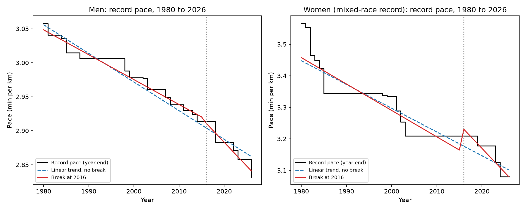
For men, both intervals exclude zero. The break model beats the straight line without a break. AIC is -447.5 against -419.9. Leave-one-out RMSE is 0.0086 against 0.0116 min/km.
For women, the HAC interval excludes zero but the bootstrap interval includes it. The model gain is small: AIC -302.4 against -297.8, and leave-one-out RMSE 0.0400 against 0.0427. I trust the wider interval here, because HAC is a poor fit with 47 correlated points.
A break at 2019, the ratification year of the Kosgei record, gives similar men's results. Men: d = -0.00305 (HAC -0.00435 to -0.00174; bootstrap -0.00591 to -0.00014). Women: d = -0.01041 (bootstrap -0.02368 to +0.00377), and women gain nothing in AIC (-297.2).
What this does not show: it does not show that the bend is caused by anything. It shows only that a line with a bend fits better than a line without one.
The placebo test
I placed the same slope break at every year from 1990 to 2010 (21 years) on the same window. Then I asked where 2016 ranks.
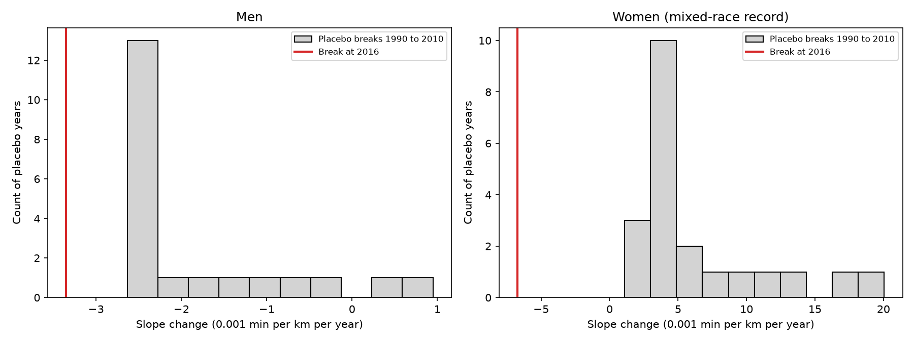
For both sexes the 2016 break is more negative than all 21 placebos. The rank is 1 of 22. With 22 candidate years, that is a permutation p of about 0.045 at best. The tests are not independent, so I read that p as loose.
The placebos differ by sex. For men, the placebo median is -0.00234, so most placebo breaks also point downward. That means the record was already falling faster in most later windows. A bend is the normal shape of this series. For women, the placebo median is +0.0039, so 2016 stands out more, but see the next section.
What this does not show: a rank of 1 does not mean 2016 is special for a reason. I chose 2016 before I ran the test, which helps. But the placebo years cover only 1990 to 2010, and the series is short.
Checks that weaken the result
This is the part I would not skip.
- Curvature. A quadratic trend with no break has AIC -453.1 and leave-one-out RMSE 0.0083 for men. That beats the linear-break model (AIC -447.5). If I add a 2016 break to the quadratic, d falls to -0.00172 (HAC -0.00345 to +0.0000036). That is about half the linear-model value, and the interval touches zero. So the men's break depends on the model.
- End date. Without the 2026 record (data to 2025), d = -0.00276 (HAC -0.00376 to -0.00176). With data to 2023, d = -0.00355 (HAC -0.00484 to -0.00226). The result does not rest on the last record. I did not check the 2026 record against a primary source.
- Women's start year. If the window starts in 1970, the women's sign flips: d = +0.0020 (HAC -0.0048 to +0.0088). The women's series is flat from 2003 to 2019 and then falls in steps.
- Women's quadratic. The quadratic with a break gives d = -0.0149 (HAC -0.0245 to -0.0054) and AIC -308.6. It is the best women's model by AIC. It rests on 14 to 18 events, so I treat it as a hint only.
- Level change. The level-change term is not stable. Its bootstrap interval includes zero for men. At 2016 it is positive for women.
My reading: the data support a faster men's fall after 2016 under a straight-line frame. A curved frame keeps about half of it. For women, the data support no firm break estimate.
What a record list cannot separate
- Shoes from pacing teams. Pacing teams and rabbits changed over the same years.
- Shoes from courses. Flat, fast courses and the Berlin and Chicago circuits produce many of the records.
- Shoes from more athletes. More and better-paid athletes would bend the line without any shoe effect.
- Shoes from list rules. The source column mixes IAAF, ARRS and press reports, and list rules changed.
- The best from the rest. A record is the single best result among many. The list says nothing about the top 10 or the median elite runner.
This is my old complaint in a new form. A lab result on running economy and a record-list result are both far from "this shoe makes this runner faster in a race". Neither one closes the gap.
My present view
A faster fall in the men's record after 2016 is likely under a linear-trend model, and it stands out against placebo years. A curved trend explains about half of it. A record list cannot name a cause. I put about 0.6 on "some real bend in the men's line after 2016" and much less on any share being due to shoes, because the list does not test shoes. I hold no firm view on the women's break.
What would change my view:
- Top-10 or median-elite times by year from a public results database. If the whole field bent at 2016, that points away from a few pacing-team records.
- A primary-source record list from World Athletics, to replace the Wikipedia secondary list.
- A larger trial of shoes in the same runners, which would test shoes directly. The shoe-injury trials I have covered before do not answer this, because they measure injuries, not race pace.
What I would do next
The next study I would trust uses race results, not records. It would take every finisher in a few large marathons from 2010 to 2026, with year and course fixed, and ask whether the whole distribution moved at 2016. A shoe effect should show up in the middle of the field. A pacing-team or course effect should not. I will try that with public results next.
Files
The outputs are parsed_records.csv, events files, results.json and break_table.csv, plus the three scripts. No app was published.