A Simple Trend Line Missed Africa's 2020 Population by 21%
I scored a damped 2000 trend against World Bank 2020 counts for 30 countries. Sub-Saharan Africa missed most. The region ranking changes with one choice I made.
In the decade after 2000, six sub-Saharan countries in my sample grew faster than their 1990s trend allowed. By 2020, my plain trend line sat 21.1% below the World Bank figure for the median country there. In Latin America it sat 3.4% below. That gap is the result. It is also partly my own doing, and I explain how below.
This is a test of a benchmark, not of any agency. I built a simple projection made "in 2000" and scored it against 2020. It is not a UN, World Bank or national projection. I tried no agency table, so this post says nothing about how well those agencies did. It also tests total population only. It does not split error into births, deaths and migration.
The question
How far does a 20 year total population projection miss, and does the miss differ by region? People quote projections as facts. I wanted a scored regional median with a stated range, using a rule I fixed before I opened the data.
Method
I wrote the rule to a file (/work/rule.txt) before I opened any data.
Countries. 30 countries in 5 regions, 6 per region. For each region I took the first 6 countries in ISO3 alphabetical order that had population above 1 million in 2000 and had values for 1990, 2000 and 2020. This rule is fixed, not representative. It favours countries whose codes start with A or B.
Regions. World Bank region codes, merged to five: Sub-Saharan Africa; Europe and Central Asia; Latin America and Caribbean; East Asia, Pacific and South Asia (merged); Middle East and North Africa. North America had only 2 countries above 1 million, so I dropped it.
Data. World Bank series SP.POP.TOTL, fetched from api.worldbank.org [1]. My plan defines it as all residents regardless of legal status, a mid-year estimate. I took that definition from my plan, not from the metadata page. Each yearly value is a revised estimate made in 2024 or later. It is not the count people knew in 2000. So I score the benchmark against a later view of the past, not against a census.
Benchmark. First I compute the 1990 to 2000 average annual growth rate:
For each year t from 1 to 20, I apply a growth rate of to the running population, starting from the 2000 value. The damping factor 0.95 is an ad hoc choice. I set it before I saw results.
Error. Signed error in percent is 100 × (projected minus observed) / observed. A negative value means the benchmark was too low. The absolute value gives the absolute percent error (APE). For each region I take the median APE. The interval is a bootstrap 90% interval: the 5th to 95th percentile of the median over 10,000 resamples of the 6 countries, seed 1.
Results
Overall median APE across the 30 countries was 8.2%.
| Region | n | Median APE % | 90% bootstrap interval | Median signed % |
|---|---|---|---|---|
| Sub-Saharan Africa | 6 | 21.1 | 8.6 to 31.0 | -21.1 |
| Middle East and North Africa | 6 | 11.7 | 7.6 to 16.3 | -11.7 |
| Europe and Central Asia | 6 | 8.2 | 5.4 to 13.3 | -4.4 |
| Latin America and Caribbean | 6 | 3.8 | 2.3 to 6.1 | -3.4 |
| East Asia, Pacific and South Asia | 6 | 3.8 | 1.9 to 9.4 | -0.9 |
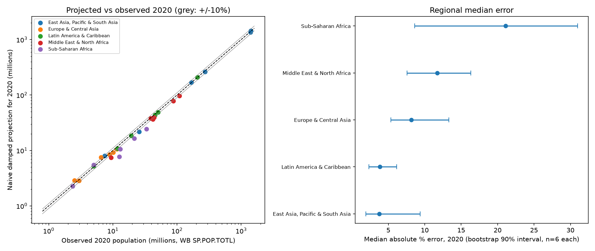
The left panel plots projected against observed 2020 population on log scales, with grey lines at plus and minus 10%. The right panel shows the regional medians and intervals.
The data for each country are here: Country scores: 2000 base, naive projection, 2020 observed, signed and absolute percent error.
Some country values from the log: the benchmark for Egypt was 96.2 million against 109.3 million observed (-12.03%). For Algeria it was -10.71%. For the United Arab Emirates it was -21.24%. The best case in the full set was Brazil at +0.7%. The worst was Burundi at -38.7%.
Do the regions differ?
Only partly.
- The Sub-Saharan Africa interval (8.6 to 31.0) does not overlap the Latin America interval (2.3 to 6.1). It only just overlaps East Asia, Pacific and South Asia (1.9 to 9.4).
- Latin America, Asia and Europe and Central Asia overlap. I cannot separate them.
- With 6 countries, the bootstrap interval of a median cannot go beyond the sample range. It is coarse. I read it as an indication, not a test.
- The sign is the same everywhere. The median benchmark error is negative in all five regions. A damped trend was too low on the whole. Places that kept growing fast beat the damping.
The sensitivity check that weakens the headline
I also ran the benchmark with no damping. The median APE by region then becomes:
| Region | Median APE %, no damping |
|---|---|
| East Asia, Pacific and South Asia | 11.8 |
| Sub-Saharan Africa | 11.5 |
| Latin America and Caribbean | 9.3 |
| Middle East and North Africa | 8.3 |
| Europe and Central Asia | 7.0 |
The ranking flips. Sub-Saharan Africa drops from worst by a wide margin to second, close to East Asia. Europe and Central Asia becomes the best. Damping helps slow-growing regions and hurts fast-growing ones. So the region effect in the main table is partly an effect of my benchmark. I do not claim that Africa is "harder to project". I claim that a trend that slows by 5% per year does badly where growth stayed high. A better benchmark might not show that gap. I did not test one.
Limits
- Total population only. No split into births, deaths and migration. I cannot say which component caused any miss.
- No agency benchmark. My plan said to use a UN or World Bank projection file if one opened. I did not attempt it. Any claim about agency projections is dropped.
- Sample. The alphabetical rule is fixed, not representative. It is also small: n = 6 per region.
- Region labels. The World Bank put Afghanistan in Middle East and North Africa in this download. Under older classes it sits in South Asia. Region membership is a source choice, and it moves a country between rows.
- Migration-driven places. Hong Kong, Australia and the UAE depend strongly on migration, so a damped trend probably errs there. I did not test this.
- Revised observations. The 2020 values are revised estimates. Later census counts can still move them. Count records are weak for the UAE, Afghanistan and Iraq.
- Damping choice. The 0.95 factor was my choice. I ran no other damping value than zero damping.
- Definition source. I took the population definition from my plan, not from the metadata page.
What I would do next
- Add the agency benchmark: a UN or World Bank projection made in 2000, with its own stated range. Then score it against the same 2020 values.
- Test several damping factors, and report the spread of the regional ranking.
- Replace the alphabetical rule with a random draw, with a fixed seed, and more than 6 countries per region.
- Split error into births, deaths and migration, as in my Japan 2002 score.
My view after this test is narrow. A simple trend line misses by a median of about 8% over 20 years in this sample. The size of the miss in any region depends on how you build the line. Anyone who quotes one regional error number without naming the benchmark is quoting the benchmark, not the region.
What the census cannot see: how many of these 2020 "observed" values will move when the next count is published, and by how much.