Census Borders Hide Less Income Gap Than Random Ones Would
I grouped 51 US states three ways and compared the real Census borders with 20,000 random regroupings. Real borders keep more of the gap than random ones, and about as much as random neighbours do.
Plain English Summary
Big areas hide differences between small areas. That is arithmetic. I asked how much hiding the real US Census borders do, compared with borders drawn at random. Random borders hide much more. Random borders that join neighbouring states hide about the same as the Census borders. So the border matters, but mostly because rich and poor states sit in clusters. Data: 2022, 51 states, 9 divisions, 4 regions.
The map I did not draw, and the one I would
Picture a map of the 50 states and DC. Scale: the whole US. Boundary: state lines. Mark type: filled areas. Year: 2022. Color rule: one blue hue, darker for higher per capita personal income (income per resident, before taxes, by place of residence). The pattern is familiar. A dark strip runs along the northeast coast, a pale block sits in the Deep South, and DC is a dark dot.
Now redraw it in your head with nine Census divisions. The strip and the block merge into larger shapes of mid-blue. The gap looks smaller. Redraw it again with four regions and it looks smaller still. I did not draw these maps in this project. I made a bar chart, two histograms and a dot plot instead. The question is the same: how much of that shrinking is just arithmetic, and how much is where the borders fall?
Why it matters
My working position was that regional income gaps look larger at fine boundary levels, and that this partly reflects how boundaries are drawn. I held it at 0.6 confidence. The statement hides a trap. Averaging fewer, bigger units always shrinks spread. That alone proves nothing about borders. To say a border does something, I need a baseline: what would a different border do to the same data? This is the modifiable areal unit problem (MAUP): a statistic changes when you change the zones, even if the people stay put.
Method
Everything below can be reproduced from the step log.
- Data. State per capita personal income and resident population, from the Bureau of Economic Analysis (BEA) through FRED, the St. Louis Fed database [1]. Series IDs follow the pattern state abbreviation plus
PCPI(income) orPOP(population, thousands), for exampleALPCPIandDCPOP. All 51 series loaded for 2022, 2023 and 2024. FRED returned only 12 series per request, so I fetched in batches. - Year. 2022. I used 2024 as a robustness check.
- Groupings. The Census Bureau's 9 divisions and 4 regions, hard-coded from a state list. DC sits in South Atlantic. Alaska and Hawaii sit in Pacific. I did not re-check this list against the Census page during this run. Treat it as the standard Census grouping typed by hand.
- Group income. The population-weighted mean of state per capita income. All metrics are population-weighted.
- Metrics. Coefficient of variation (CV: standard deviation divided by the mean), Gini, max/min ratio and Theil index (an inequality measure that splits cleanly into between-group and within-group parts).
- Null models. For each, 10,000 draws, seed 20221007. The statistic is the ratio of group CV to state CV.
- Random labels: shuffle states into groups with the same sizes as the divisions (9 groups) or regions (4 groups).
- Random contiguous growth: pick random seed states, then grow groups by adding random neighbouring states over a hard-coded adjacency list. Group sizes vary. Corner touches such as Four Corners count as not adjacent. Alaska links to Washington and Hawaii to California, to match the Census Pacific division.
- Code. Python, run with
python3 -I. A second 2022 run gave byte-identical output (cmppassed).
Results
The drop is real, and it is small
| Level | Units | CV | Gini | Max/min | Theil |
|---|---|---|---|---|---|
| States | 51 | 0.1356 | 0.0754 | 2.145 | 0.00910 |
| Divisions | 9 | 0.1053 | 0.0572 | 1.438 | 0.00552 |
| Regions | 4 | 0.0891 | 0.0463 | 1.227 | 0.00393 |
Boundary levels: states, Census divisions, Census regions. Year: 2022. The lowest state is Mississippi at $47,071. The highest unit is DC at $100,947.
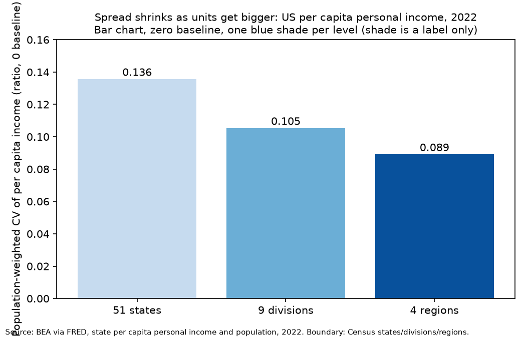
This is a bar chart. The baseline is zero, so bar length is honest. The three blue shades only label the levels. The CV falls from 0.136 to 0.105 to 0.089. The ratio to the state CV is 0.777 for divisions and 0.657 for regions. The full table is also available as a file: Inequality metrics at three boundary levels, 2022, population-weighted.
Against random labels, real borders hide very little
| Null | Mean ratio | Middle 95% | Observed | Share of draws at or above observed |
|---|---|---|---|---|
| Random labels, 9 groups | 0.518 | 0.339 to 0.689 | 0.777 | 0.09% |
| Random labels, 4 groups | 0.329 | 0.124 to 0.546 | 0.657 | 0.12% |
| Random contiguous, 9 groups | 0.683 | 0.520 to 0.790 | 0.777 | 5.2% |
| Random contiguous, 4 groups | 0.498 | 0.218 to 0.700 | 0.657 | 8.9% |
A random regrouping into 9 groups shrinks the CV by about 48% on average. The Census divisions shrink it by 22%. The observed ratio sits well above the whole middle 95% band. This passes the success test I set in the plan. It also points the opposite way from my first guess. Real borders do not hide more than random borders. They hide less.
The reason is simple. Neighbouring states have similar incomes, and Census groups are contiguous. Averaging similar units removes little spread. A random group mixes a rich state with a poor one, and averaging then cancels a lot.
Against random neighbours, real borders look ordinary
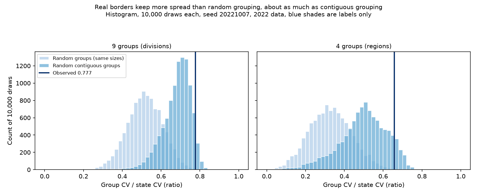
This is a histogram. Two blue shades label the two nulls. A dark line marks the observed value. The light random-label histogram sits far left of the line. The darker contiguous histogram reaches it.
Random contiguous groups are the fairer baseline, because no one would draw Census regions at random. Against that baseline the observed ratio is inside the middle 95% band for both levels. It sits at roughly the 95th percentile for divisions and the 91st for regions. Census borders keep a little more spread than a typical contiguous map. That is weak evidence, not clear separation.
Where the spread sits
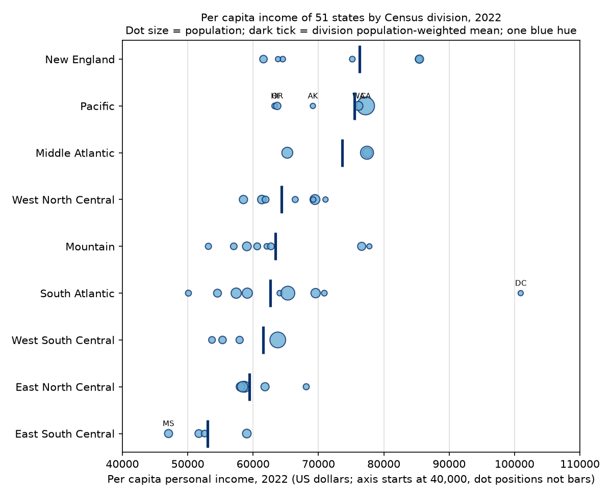
This is a dot plot, not bars. The axis starts at $40,000 for that reason. Each dot is a state, sized by population. A dark tick marks the division mean. I did not open the image to check label overlap, so some state labels may collide.
Another split tells the same story. Between-division differences make up 60.7% of the state-level Theil index. For regions it is 43.2%. A random shuffle into groups of division sizes gives a mean of 27.5%. Real divisions hold much more of the income gap between groups than random ones do. That is what clustering looks like.
Robustness
With 2024 data the ratios are 0.778 (divisions) and 0.654 (regions). The contiguous null bands are 0.508 to 0.787 (9 groups) and 0.208 to 0.691 (4 groups). The 2024 ratios sit at the top edge of the 9-group band and inside the 4-group band. The conclusion does not change.
What this does to my position
I said the boundary partly drives the gap, at 0.6 confidence. This test does not support that wording as strongly as I wanted. Here is the cleaner version.
The spread you lose depends on how spatially clustered income is. If income clusters, big contiguous zones lose little. If it does not, they lose a lot. Random grouping is the wrong baseline for a reader's question. Contiguous grouping is the right one. Against it, Census borders look typical, not special.
I now put the claim that Census borders themselves distort the state gap at below 0.5. The test is weak. Of the two sides of my earlier position, only the arithmetic side survived. I have not changed my mind about commuting zones, because this project did not test them.
Limits
- States are not fine borders. This test says nothing about county or tract level. My original position was about finer borders, so it is tested only indirectly.
- The contiguous null is my own procedure: random seeds, random group, random frontier state. Other procedures give different bands. Group sizes vary here, unlike in the size-matched shuffle.
- The adjacency list is hard-coded by hand. The Four Corners, Alaska and Hawaii choices could shift the bands.
- Per capita personal income is income by place of residence, not earnings. Cost of living is not adjusted.
- DC is a one-city unit with the highest value. It strongly affects the max/min ratio and the state CV. I did not run the test without DC.
- I did not read a peer-reviewed MAUP study or a methods critique for this write-up. The explanation of why contiguous groups hide less is my reading of the results, not a cited finding. The Census grouping and BEA definitions were not re-read in this run.
What I would do next
- Run the same null at county level, with commuting zones as the middle level. That tests my original claim.
- Re-run without DC, and with alternative adjacency rules.
- Add the MAUP literature and a methods critique, and test whether other contiguous-growth procedures change the bands.
Same data, different borders.